Brand strategy, visual identity and collateral for a real estate investment brand.
Brand strategy and voice
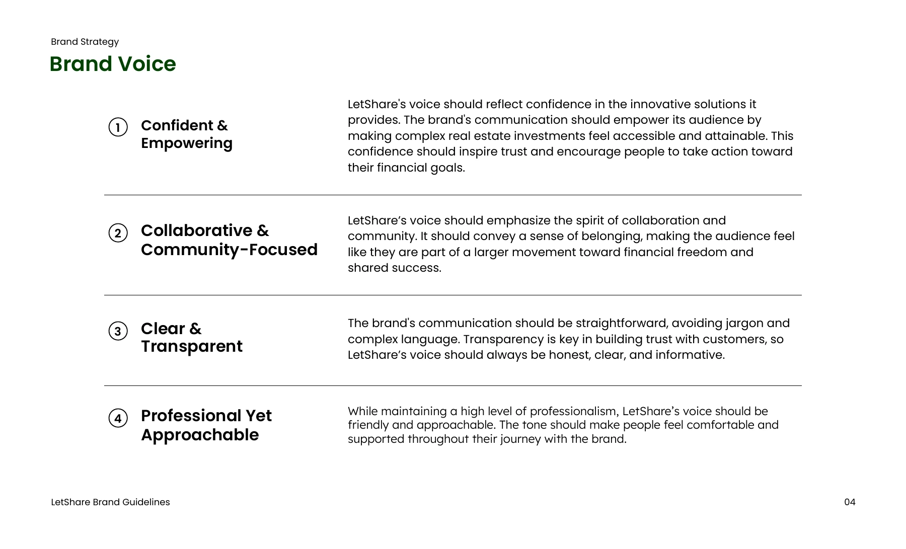
LetShare is a real estate investment brand built around making investing easier to understand and more approachable. The voice is confident, clear and community-focused. It explains complex ideas in plain language and encourages people to learn and make informed decisions.
Logo and icon
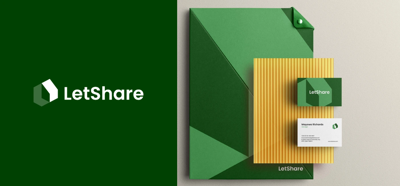
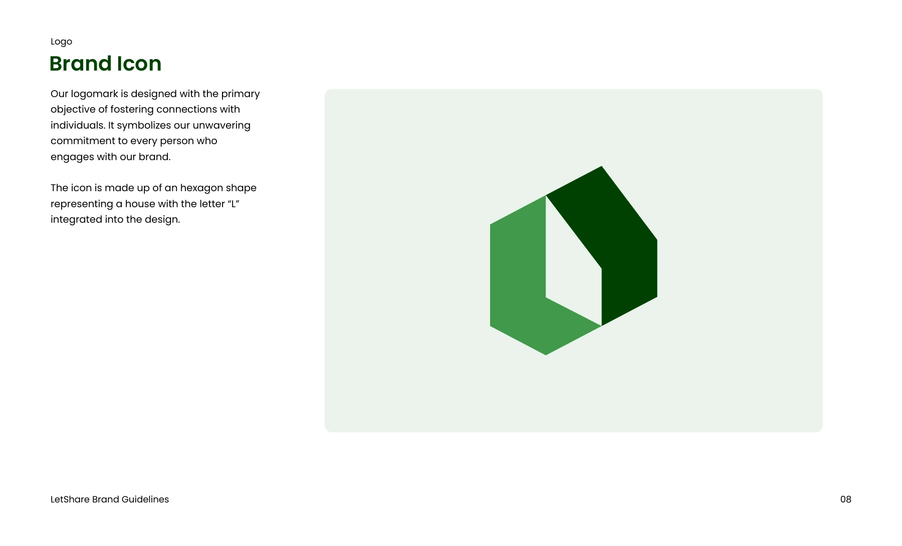
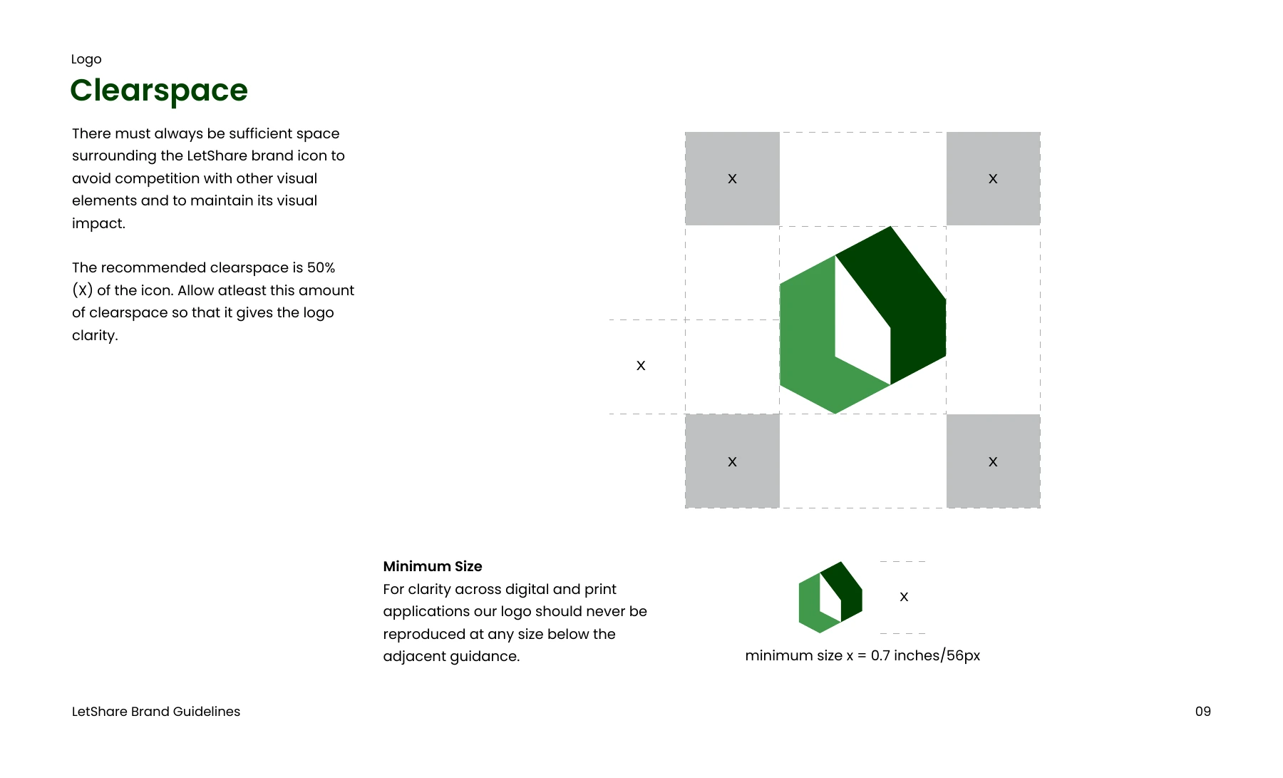
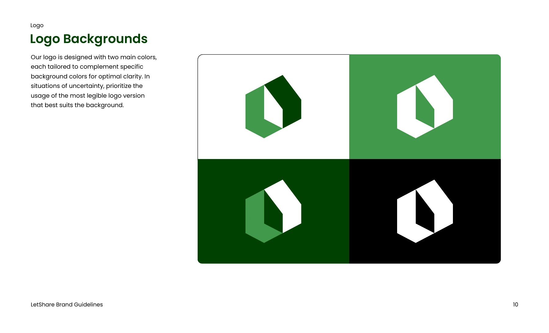
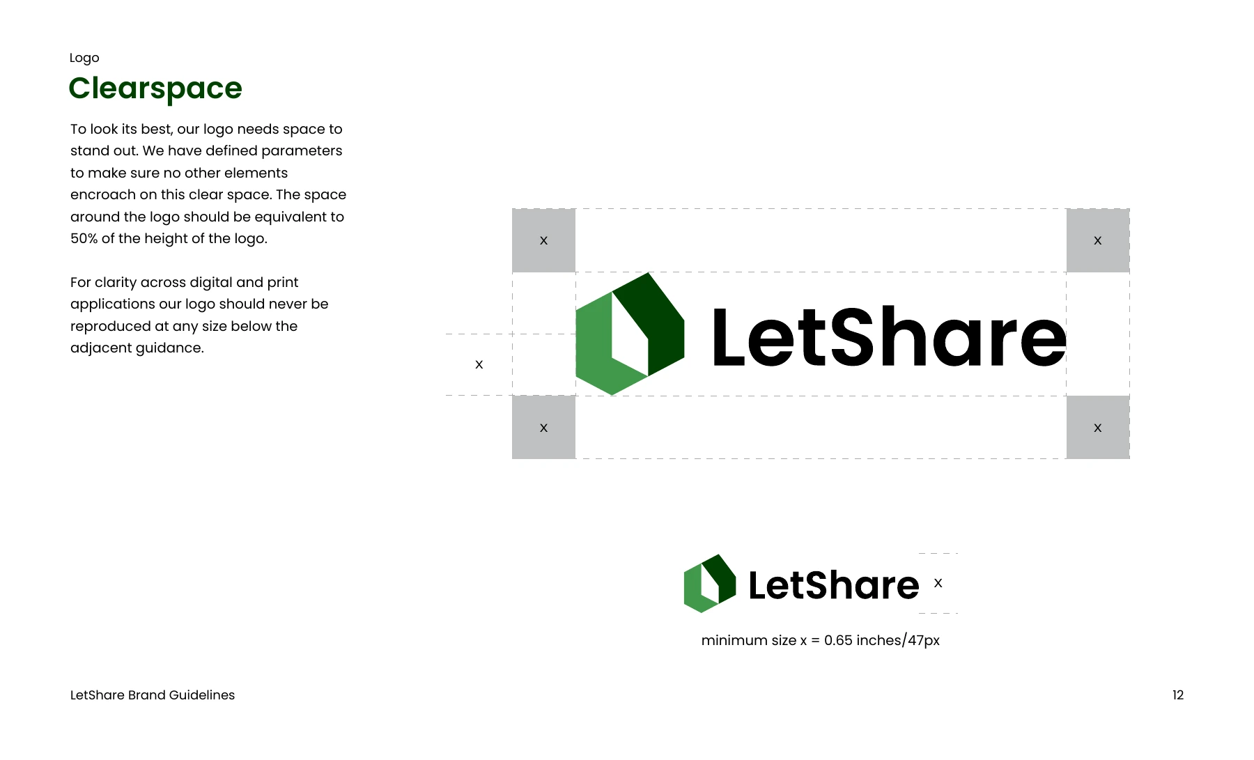
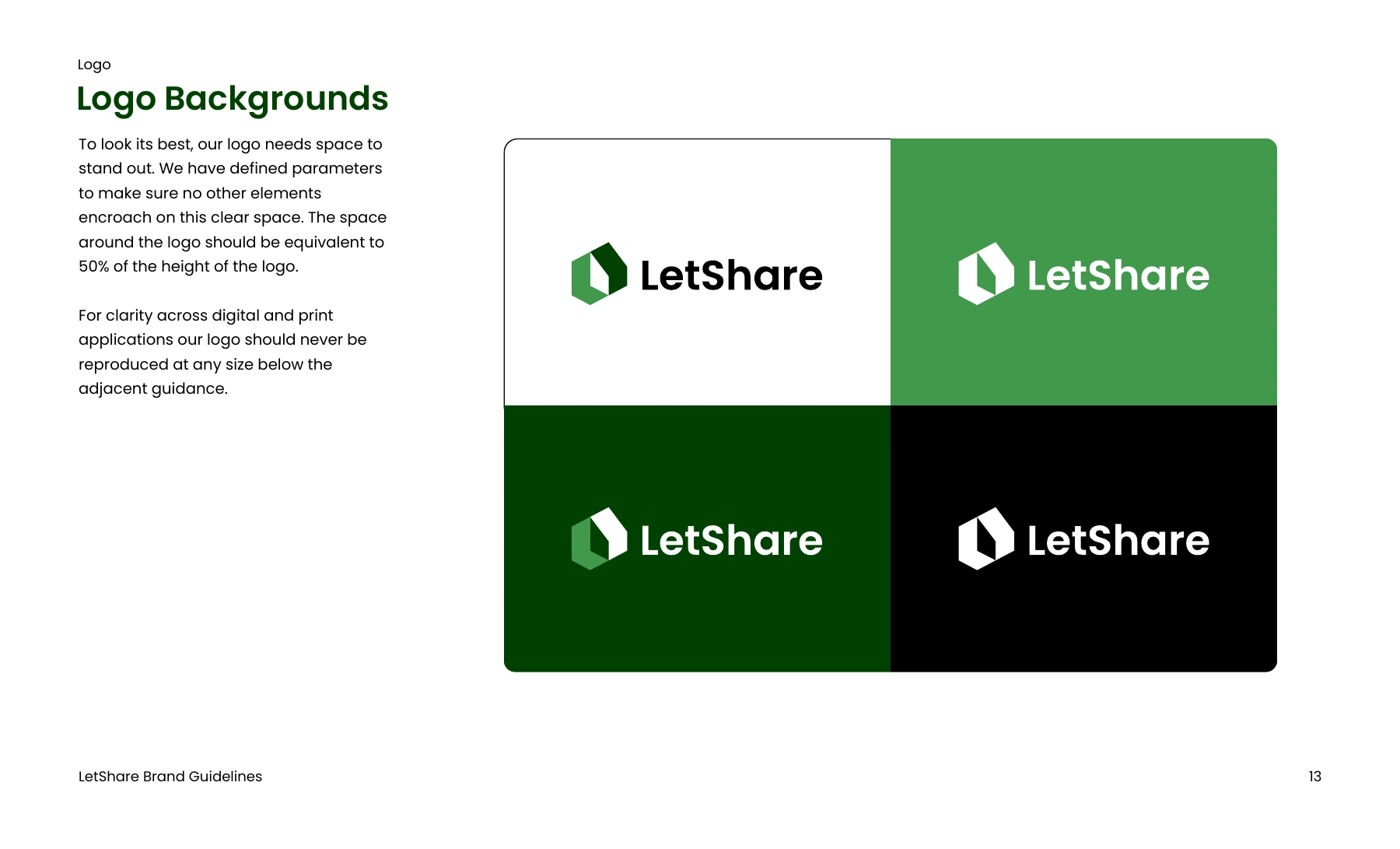
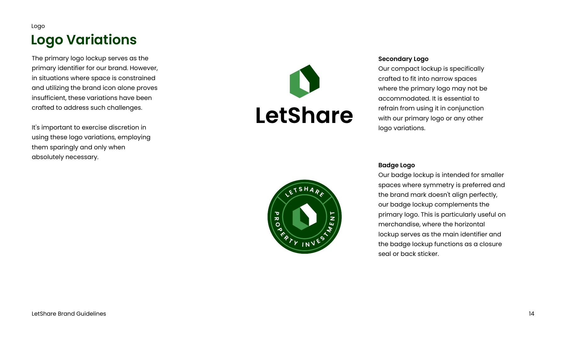
Two green shapes form an open, house-like mark that connects the identity to real estate. The mark pairs with the LetShare wordmark and can stand on its own in compact placements. Clear-space, minimum-size and background guidance keep both versions legible across print and digital formats.
Colour and typography
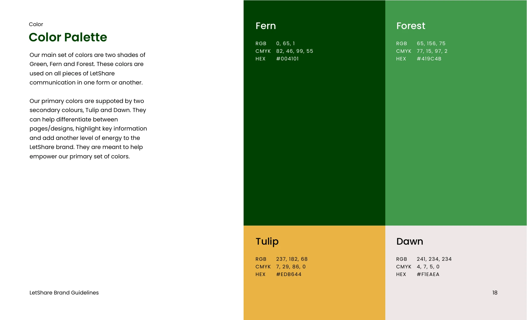
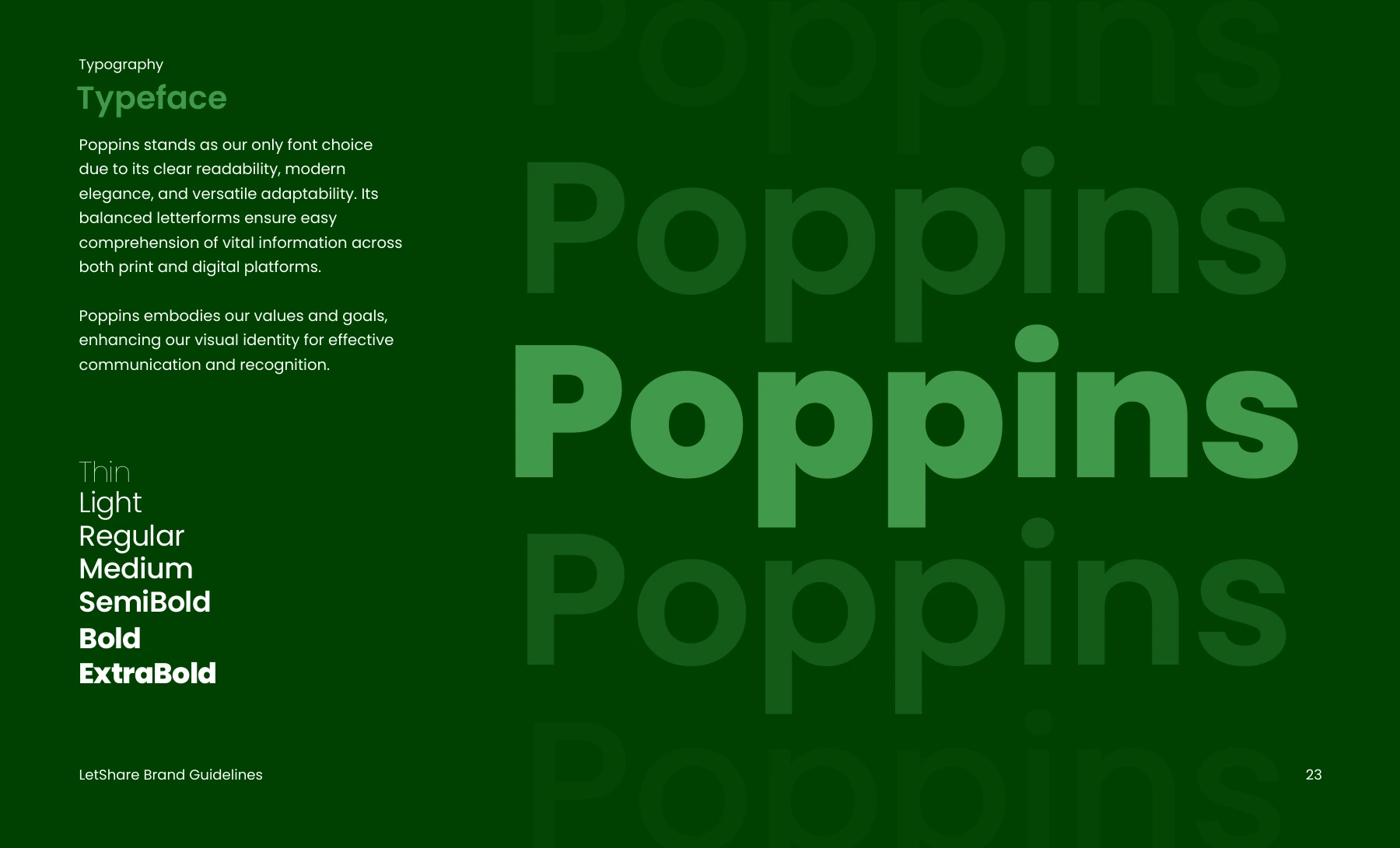
Deep and mid-tone greens anchor the identity, with warm yellow adding contrast across collateral. Poppins provides a consistent hierarchy, from bold campaign headlines to smaller explanatory text.
Graphic identifiers
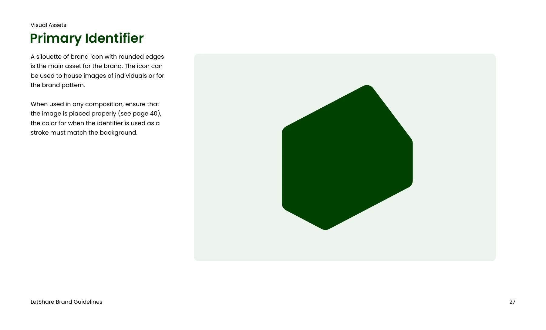
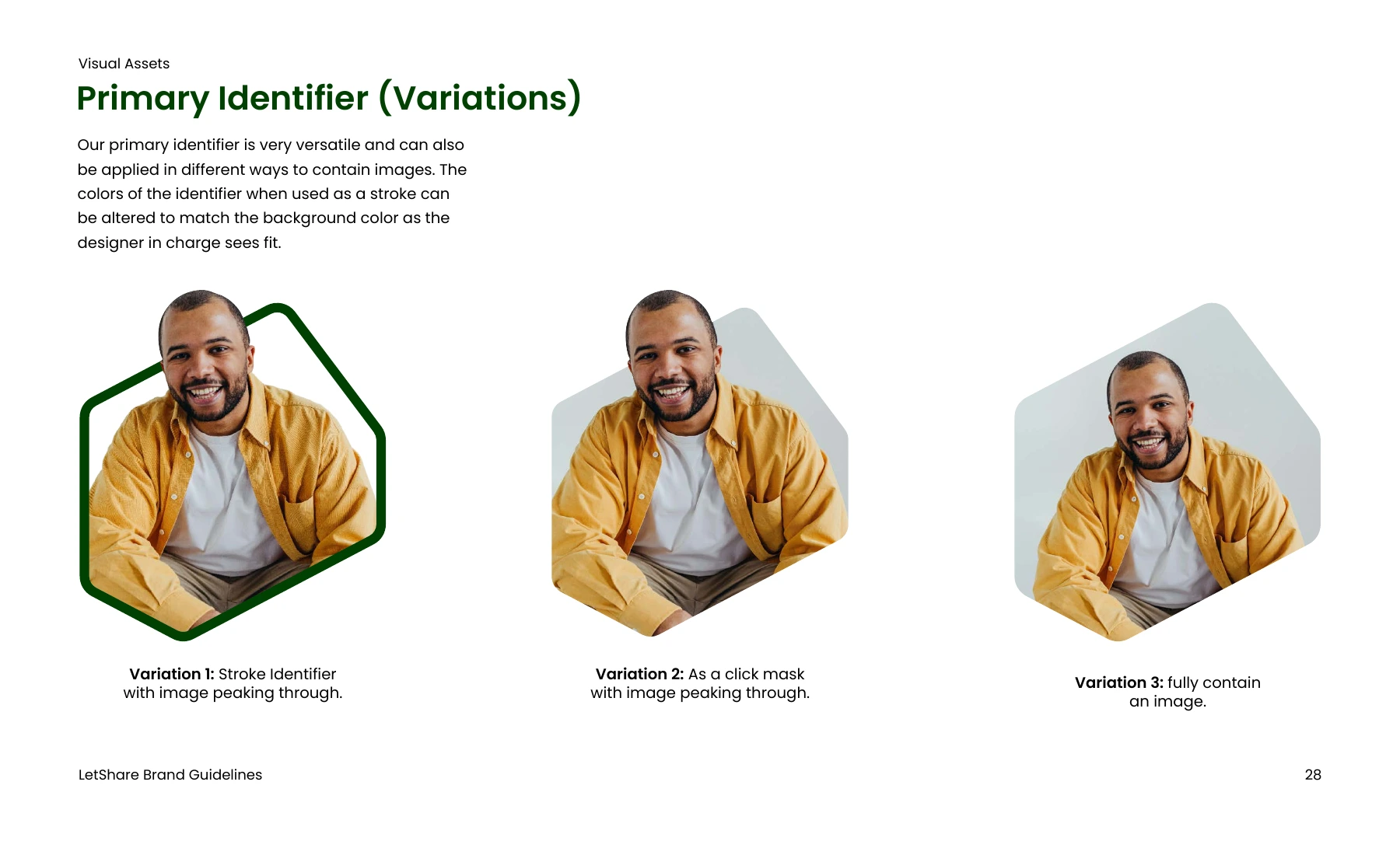
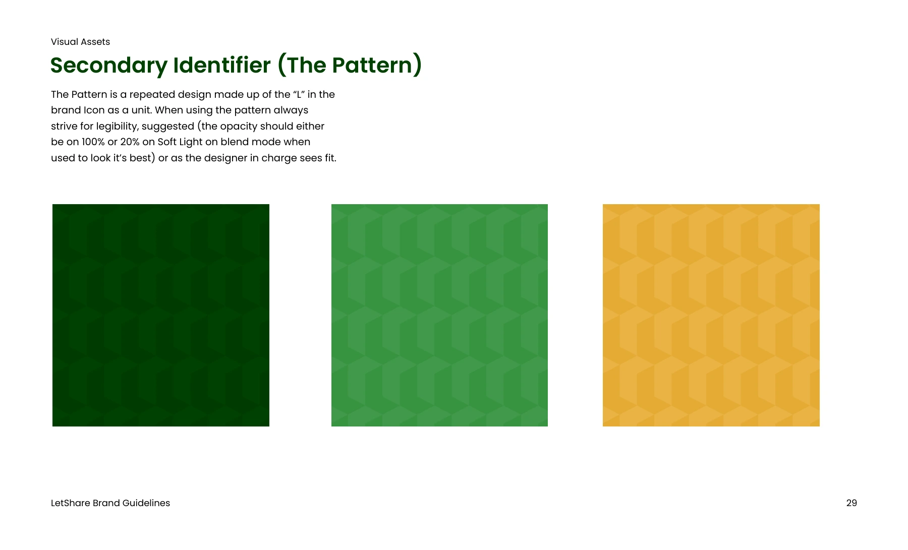
The logo geometry extends into a graphic shape that can frame photography or work as an outline. Repeating the L-shaped element creates a pattern that carries the identity across backgrounds, stationery and merchandise.
Brand collateral
The identity extends from everyday correspondence and staff materials to merchandise and public-facing campaign formats.
Stationery and staff materials
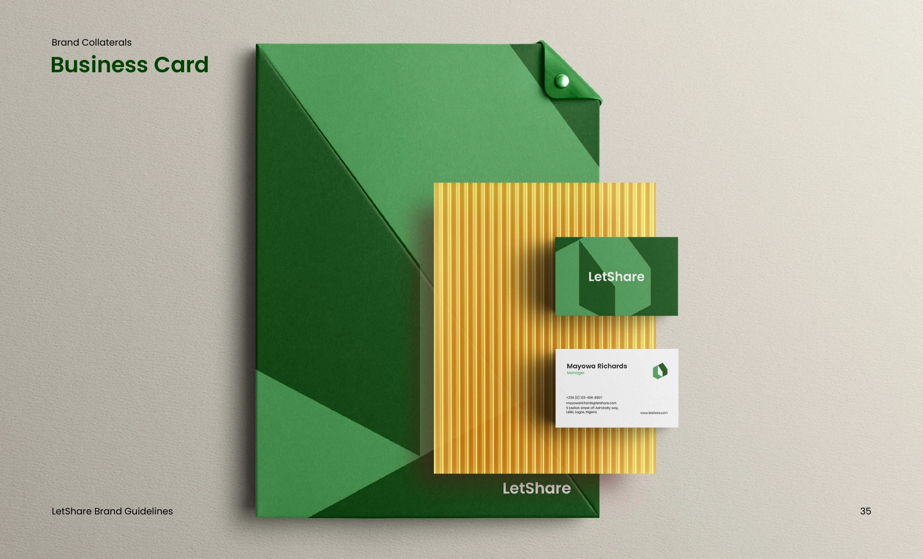
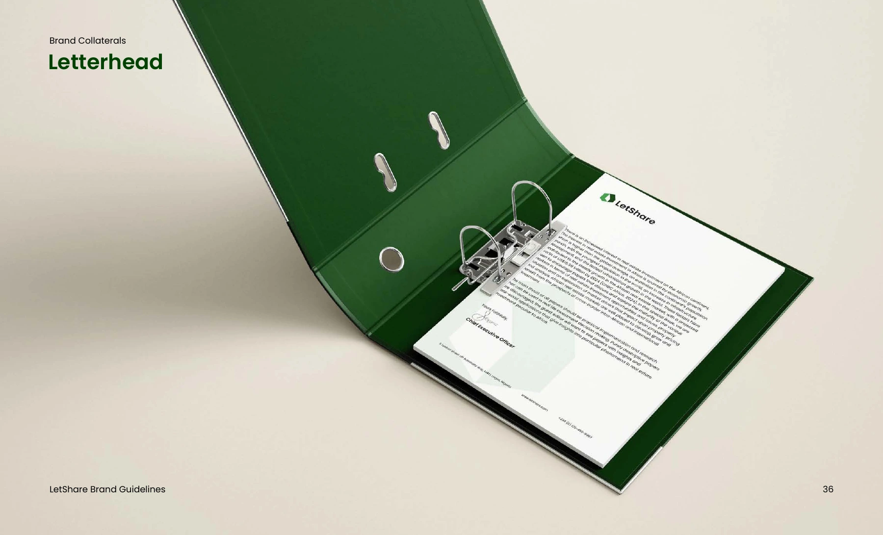
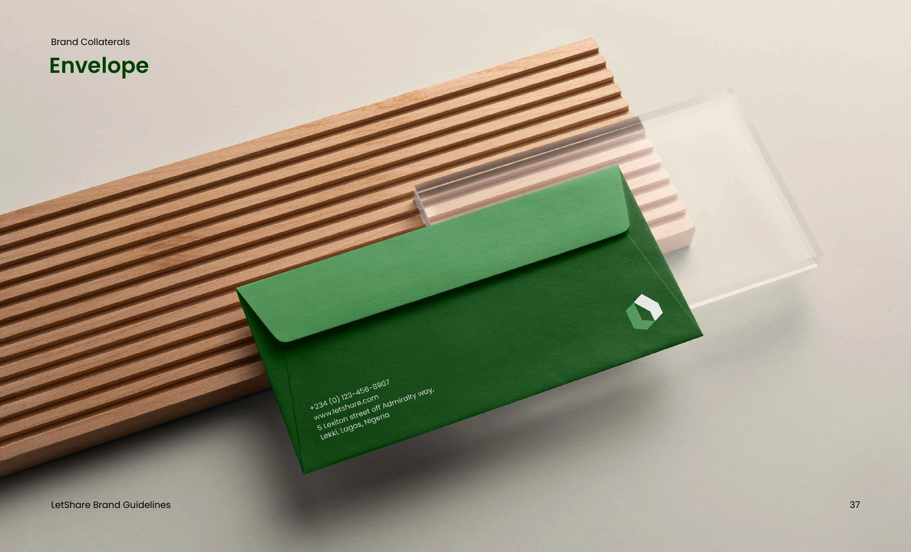
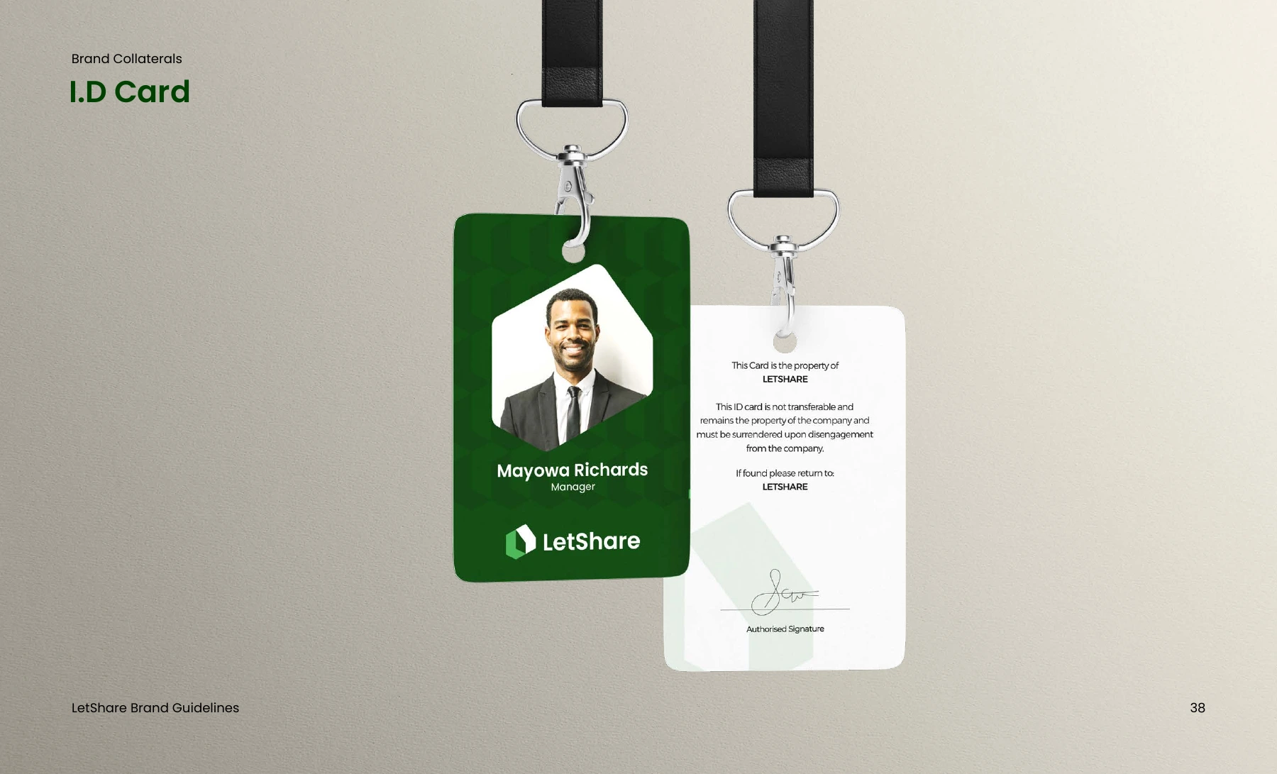
The business card, letterhead and envelope use the same logo system across formal correspondence. The ID card carries that system into staff identification with a portrait frame drawn from the brand geometry.
Apparel and merchandise
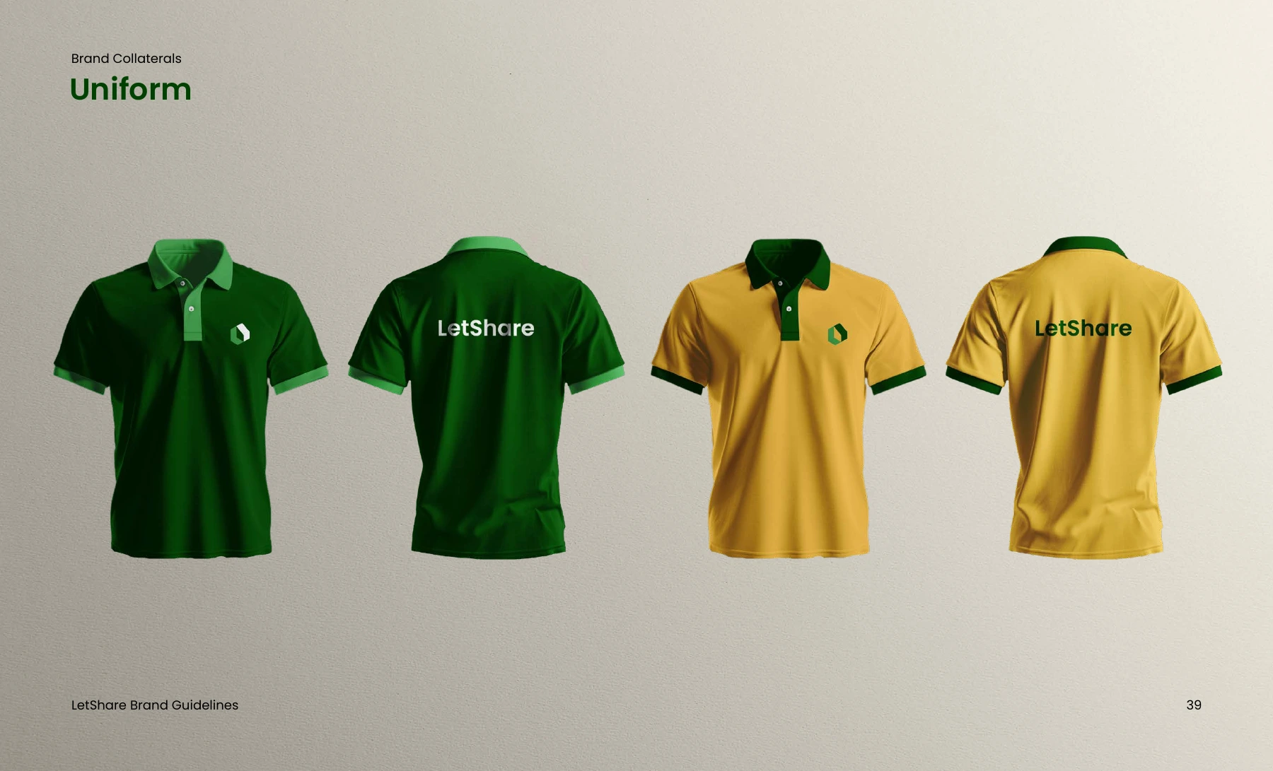
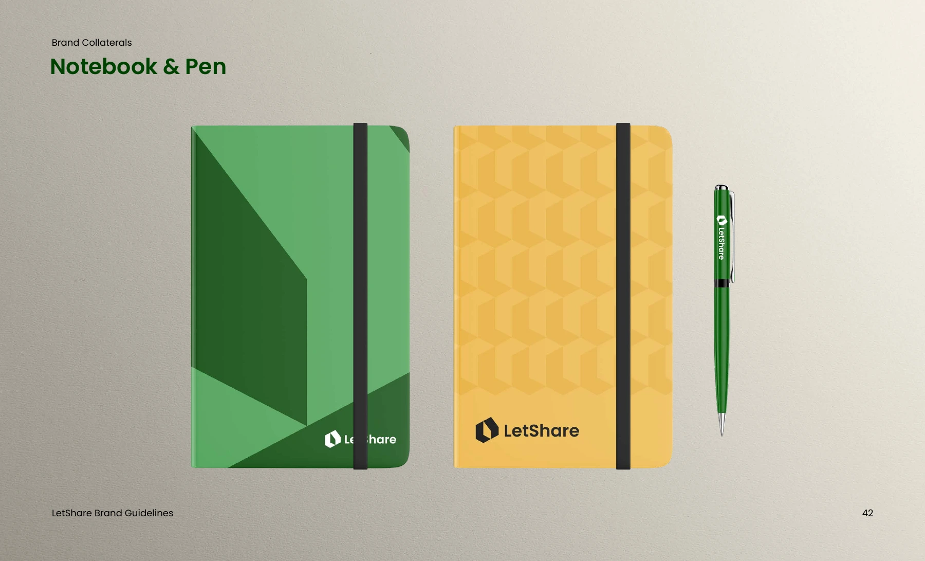
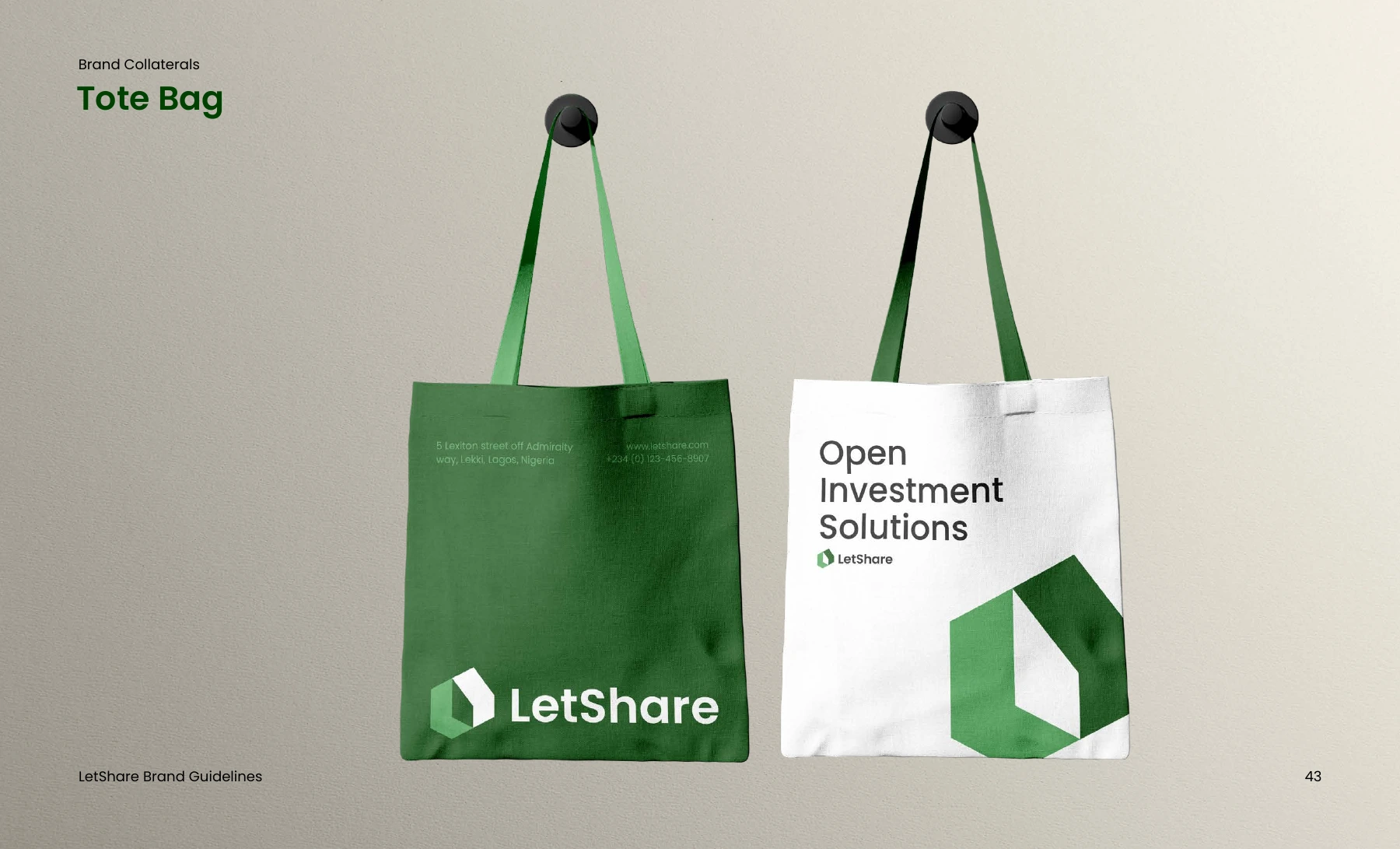
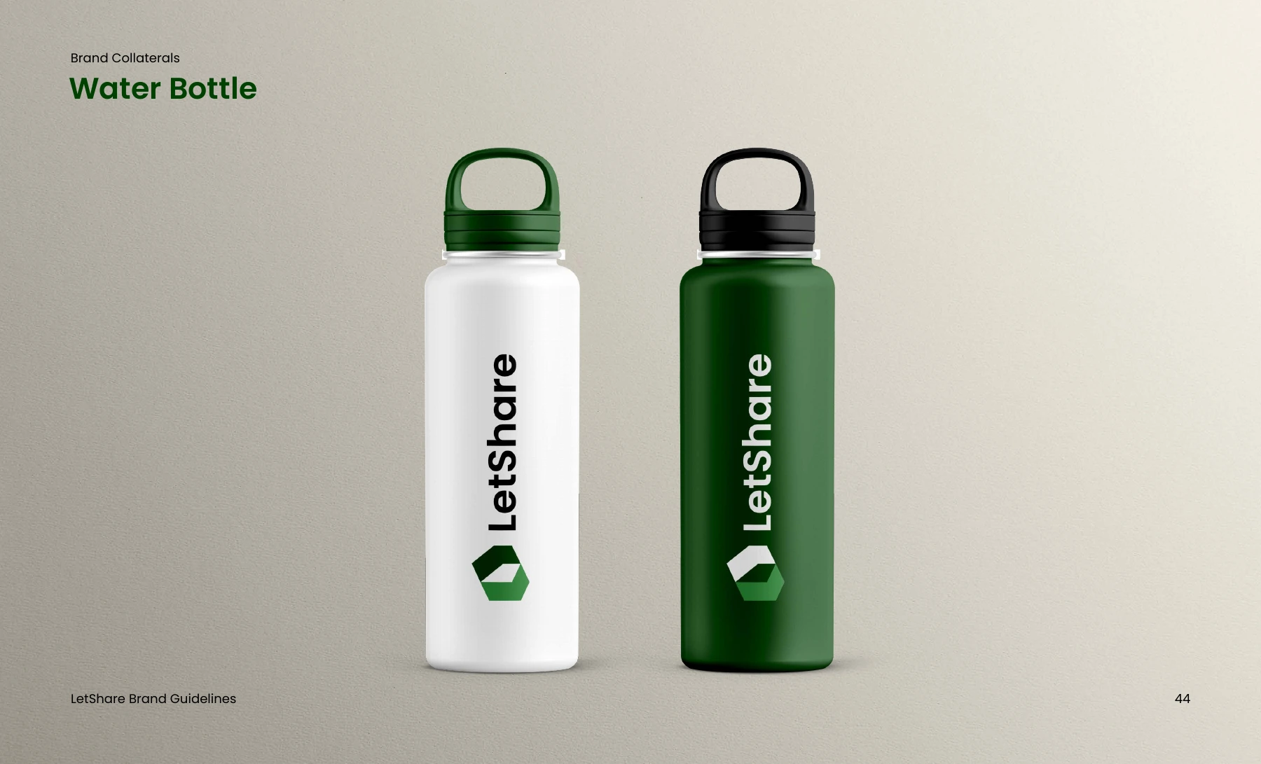
The uniform and clothing tag show how the mark translates to fabric. On the flash drive, notebook and pen, tote bag and water bottle, the lockup and pattern adapt to different sizes and surfaces.


Campaign and signage
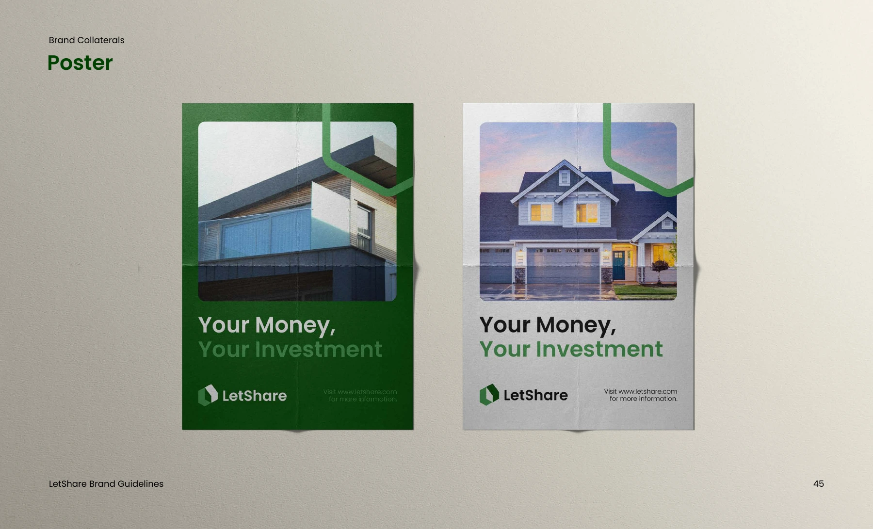
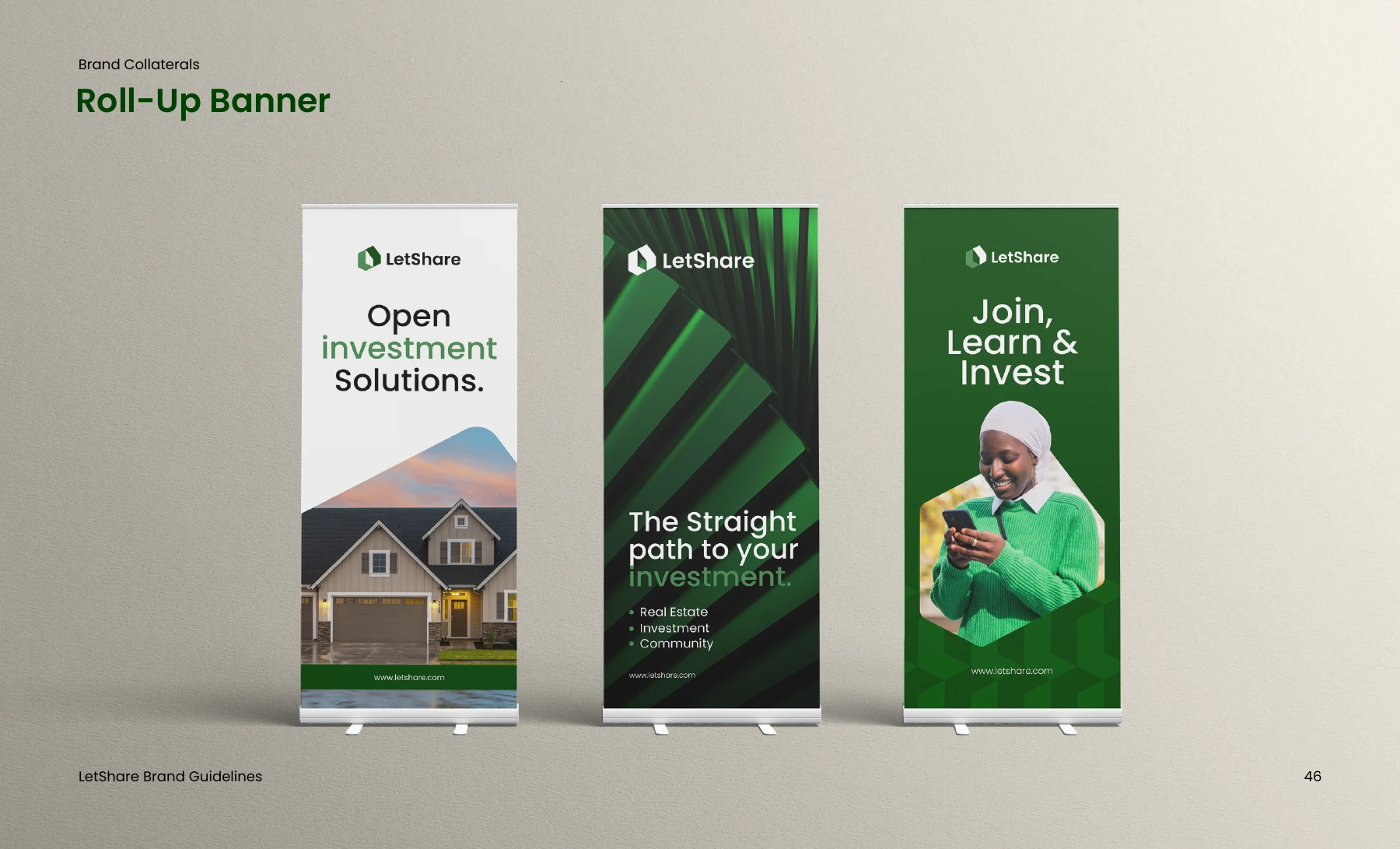
The poster, roll-up banners and billboard pair short investment messages with property and lifestyle photography. A consistent hierarchy keeps the headline prominent across each format.